
TL;DR

Get business pricing on monitors, keyboards and dev gear
- Business-only prices and quantity discounts
- Tax-exempt purchasing
- Multiple users, one account, clear invoices
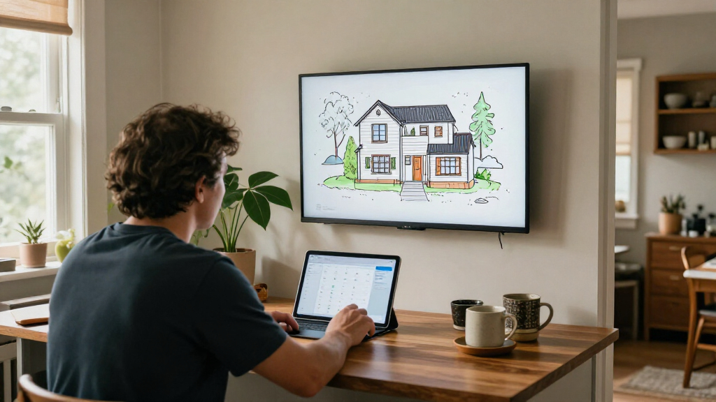
Anton Frolov commissioned an illustrator to draw his home and used the artwork as the background for an interactive Home Assistant dashboard. His account says the approach made the controls more appealing to his family, while relying on Home Assistant’s picture-elements card and carefully prepared image files.
Anton Frolov says he commissioned an illustrator to draw his house and turned the resulting artwork into an interactive Home Assistant dashboard, with animated device states and controls layered over rooms and outdoor areas. The project addressed a practical problem: his family did not want to use his previous dashboard, even though some home devices still required app-based control.
Frolov had spent about a year automating his home with Home Assistant, the open-source smart-home platform. He describes routines that switch off air conditioners when the household leaves and adjust sprinkler run times according to weather. Yet some tasks still required a person to use an app, including extending a timer for the garden lights before they switched off. He says the existing dashboard was not one the rest of the family wanted to use.
Rather than add a physical switch, Frolov explored an illustrated floor plan that could show the home and its devices in context. He chose an environment artist after reviewing portfolios and discussing the intended result. For the commission, he supplied an architectural plan, room photos, visual references, examples of dashboards and a technical brief specifying image formats and device layers.
The brief called for transparent PNG artwork, separate day and night versions, and device images that could show an off state or a short animation when on. Frolov says that exporting every asset to the same-size canvas, with each element in its correct location, prevented time-consuming alignment work. He also recommends asking for animated WebP files when animations are needed; he had initially requested PNG sprite sheets and converted them himself.
A Dashboard Designed Around the Home
The project illustrates a practical design choice for smart-home interfaces: the house itself can be the navigation layer, rather than a list of devices or abstract controls. A visible lamp, air conditioner or sprinkler can be represented where it sits, potentially making the system easier for household members to understand and use.
Frolov’s account also shows that the main work may be preparation rather than coding. Commissioning usable artwork required a clear technical brief, consistent asset dimensions and separate images for different states. That matters to other Home Assistant users considering a similar interface: the custom illustration is not just decoration but the foundation of how the controls appear.
His report is a personal account, not a controlled usability study. It offers an example of one household’s solution and does not establish that illustrated dashboards will work better for every user or home.
As an affiliate, we earn on qualifying purchases.
Home Assistant can automate devices in the background, but Frolov says automation did not remove every need for manual input. The garden lights, for example, had a timer that switched them off after a period. As that limit approached, the lights blinked to prompt someone to open an app and extend the timer. That arrangement depended on people being willing to use the interface.
Frolov considered floor-plan dashboards after reviewing examples, including three-dimensional layouts and pixel-art designs. He found that many 3D examples used a static model with interactive icons layered over it. He liked the pixel-art concept but would have needed to create the artwork himself or assemble it from existing sprites. An illustrator’s established style offered another route: a hand-drawn representation tailored to the home.
For the technical implementation, Frolov says he used Home Assistant’s built-in picture-elements card. The illustration serves as the background; image elements represent devices, while icons and labels display controls or readings. Conditional elements can appear or disappear depending on a device’s state.
“For the first time, it’s one the whole family actually enjoys using.”
— Anton Frolov, in his report
interactive home assistant display
As an affiliate, we earn on qualifying purchases.
As an affiliate, we earn on qualifying purchases.
What the Account Does Not Establish
The source is a single user’s account. It does not report how many family members used the dashboard, how usage changed, or whether the illustrated layout improved task completion compared with the earlier interface. The article excerpt also ends while describing how the dashboard changes an image when a device’s state changes, so further implementation details are not available in the supplied material.
The report does not provide the commission’s cost, the artist’s identity, or a full assessment of maintenance and compatibility over time. It is also unclear how the dashboard is presented on different screen sizes or how the household handles controls if the artwork or network is unavailable.
smart home control panel with artwork
As an affiliate, we earn on qualifying purchases.
As an affiliate, we earn on qualifying purchases.
Further Build Details Remain Open
No follow-up release or product milestone is identified in the source material. The immediate next step for readers interested in the method is to consult Frolov’s full report for any implementation details beyond the supplied excerpt, then adapt the asset brief and dashboard layout to their own home and devices.
For Frolov’s project, the key confirmed implementation components are the commissioned artwork, state-specific images and Home Assistant’s picture-elements card. Whether he plans to publish reusable files, update the dashboard or report measured changes in family usage is not stated.
animated home assistant device controls
As an affiliate, we earn on qualifying purchases.
As an affiliate, we earn on qualifying purchases.
Key Questions
What did Anton Frolov build?
He commissioned a hand-drawn illustration of his house and used it as the background for an interactive Home Assistant dashboard, placing device images and status information over the artwork.
Why did he commission an illustrator?
Frolov says his family did not want to use his previous dashboard, although some smart-home tasks still required app control. He wanted a floor-plan interface that people in the household would find more appealing.
How was the dashboard made interactive?
According to Frolov, he used Home Assistant’s built-in picture-elements card. The illustration acts as a background, with images, icons, labels and conditional elements layered on top to represent devices and their states.
What artwork files did the project require?
Frolov’s brief requested transparent PNGs, day and night versions, and separate device assets for off and on states. He says using a shared canvas size and consistent element positions helped avoid later alignment work; for animations, he recommends requesting WebP files.
Does the report prove illustrated dashboards work better?
No. Frolov says his family enjoys using this dashboard, but the source is a personal account and gives no comparative usability measurements or broader evidence about other households.
Source: hn
Fall Picks
fall essentials
As an affiliate, we earn on qualifying purchases.