
The psychological power of color palettes in home decor influences your mood, perception, and overall sense of well-being. Warm tones like reds and oranges energize your space, making it lively and motivating, while cooler shades like blues and greens promote calmness and relaxation. Light colors can make rooms feel larger, and dark hues create intimacy. By choosing colors intentionally, you can craft an environment that supports your emotional needs and daily routines—discover how to optimize your home’s atmosphere with thoughtful color choices.
Key Takeaways
- Color palettes influence mood and perception, shaping the emotional atmosphere of a home space.
- Carefully chosen colors can enhance relaxation, motivation, or energy, supporting mental well-being.
- Light and neutral tones make rooms feel larger and more open, affecting spatial perception.
- Warm tones energize active areas, while cool shades promote calmness and relaxation.
- Strategic color combinations align with personal goals and lifestyle needs, optimizing home environment and mental health.
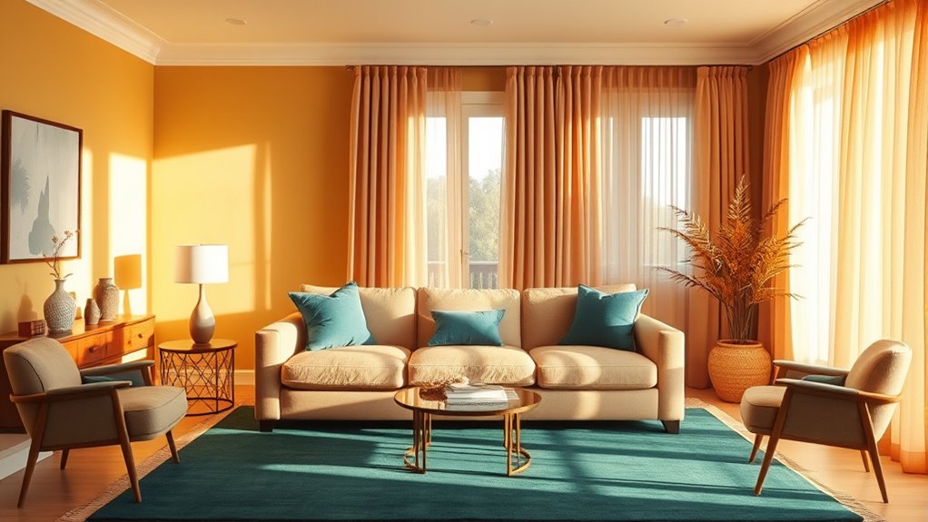
Color plays a powerful role in shaping the atmosphere of your home, influencing your mood and behavior without you even realizing it. When you choose specific color palettes, you’re not just decorating; you’re actively shaping how you feel and how your space is perceived. For instance, warm tones like reds and oranges can energize a room, making it feel lively and inviting, while cooler shades like blues and greens promote calmness and relaxation. The right color choices can enhance your mood, helping you feel more motivated or more at peace depending on what you need. This subconscious impact is a key reason why color psychology has become a crucial part of home decor.
Color influences mood and perception, with warm tones energizing and cool shades promoting calmness in your home.
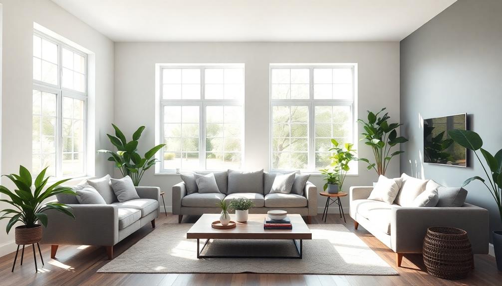
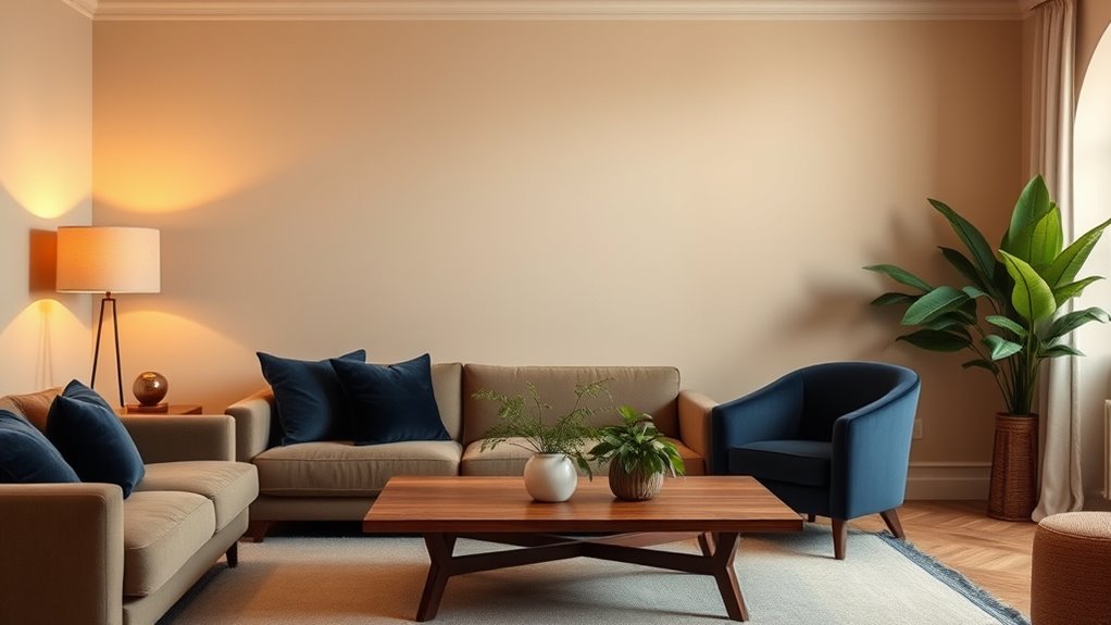
Your choice of colors also considerably affects the spatial perception of your rooms. Light colors, such as pastels and whites, can make a space seem larger and more open, which is perfect for smaller rooms or areas where you want to maximize a feeling of airiness. Conversely, darker hues tend to create a cozy, intimate atmosphere, making a larger room feel more inviting and warm. When you’re designing your space, understanding how color influences spatial perception allows you to manipulate the environment to suit your needs. Want a small room to feel more expansive? Opt for light, neutral shades. Looking to create a snug, comfortable retreat? Rich, deep colors might be just what you need.
Color also plays a subtle but impactful role in enhancing your overall well-being. The psychological effects of color can influence your energy levels, stress, and even your productivity. For example, yellow can boost your happiness and stimulate mental activity, making it a good choice for home offices or kitchens. In contrast, muted tones like soft grays or taupe can help reduce anxiety, creating a serene space for relaxation or sleep. Additionally, certain essential oils have been used to support emotional well-being and promote a calming atmosphere, further enhancing the mood of your environment. By consciously selecting colors that support your desired mood and function, you can craft environments that not only look appealing but also support your mental health and daily routines.
Ultimately, your understanding of how color affects mood enhancement and spatial perception gives you the tools to design spaces that serve both aesthetic and psychological purposes. Whether you want to energize your mornings, wind down in the evening, or make your rooms feel larger and more welcoming, the right color palette makes a difference. It’s about intentionally choosing hues that align with your goals and personal style, transforming your home into a space that truly supports your lifestyle.
Frequently Asked Questions
How Do Cultural Differences Influence Color Psychology in Home Decor?
Cultural differences greatly influence how color psychology impacts your home decor choices. You might see certain colors as symbols of luck or spirituality, shaped by cultural symbolism. Regional preferences also play a role, guiding your color selection to match local traditions or beliefs. By understanding these cultural influences, you can create a space that resonates personally, honoring your background while shaping the mood and ambiance you desire in your home.
Can Color Palettes Affect Mood Differently Across Age Groups?
Imagine your home’s color palette holding the power to influence moods differently for each age group. You might notice that younger generations prefer vibrant, energetic hues, fueling excitement, while older adults lean toward calming, neutral tones that promote relaxation. These age-specific color preferences shape generational mood responses, making it essential to choose palettes thoughtfully. Don’t underestimate how your color choices can evoke distinct feelings across different ages in your home.
Are There Any Colors That Universally Promote Relaxation at Home?
You might wonder if any colors universally promote relaxation at home. While color psychology myths suggest certain hues, neutral color schemes like soft beiges, grays, and gentle blues are widely known to create calming environments. These shades don’t evoke strong emotions, making them versatile choices for relaxation. Remember, individual preferences matter, but sticking to neutral tones often helps foster a peaceful, soothing atmosphere in any space.
How Does Lighting Impact the Psychological Effects of Color Palettes?
Lighting greatly influences how colors affect your mood. Natural light enhances warm tones, making spaces feel inviting and vibrant, while it can also soften cool shades for a calming effect. Artificial lighting, like warm or cool bulbs, alters color perception and mood. You should carefully choose lighting to complement your color palette, ensuring your space feels relaxing or energizing, depending on your desired atmosphere.
What Are the Best Color Combinations to Enhance Productivity?
Boost your busy brain with bold, balanced color combinations. Opt for high-contrast hues like blue and yellow to spark focus, or embrace calming monochromatic schemes with soothing greens to sustain concentration. These color contrasts stimulate alertness, while monochromatic schemes minimize distractions, helping you stay productive. By choosing the right colors, you create a workspace that encourages clarity, creativity, and concentration, ultimately enhancing your efficiency and effectiveness.
Conclusion
Imagine walking into a room painted in calming blues or energizing yellows, each hue shaping your mood and comfort. By choosing your color palette thoughtfully, you create a sanctuary that reflects your soul and influences your day. Your home becomes a canvas of emotion, where every shade whispers serenity or sparks creativity. Embrace the power of color, and transform your space into a vibrant haven that nurtures your spirit and sparks joy every time you step inside.